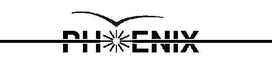
Hi Dave, here are some things I've been working on. In particular, I learned
enough about bezier curves in postscript to properly define the bird. An
important detail is that the wingtips should not go to zero, since that leads
to losses visually and in copying processes. Also the bird is not symmetric. I
also made the horizontal line, and the star lines a little thinner for better
balance.
Here is the thing defined in b/w:
 postscript
here is the same thing with a little color:
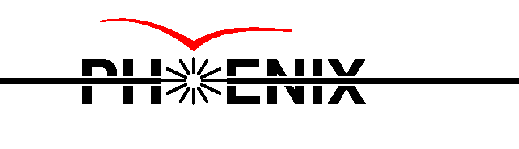 postscript
I converted ps to gif, and then shrunk the gif. Clearly the edges are already
ragged. What we should do is try out different ways of scaling and converting
like you said, ad see how it comes out...
I also want to make several full-size sheets like front pages etc, headers,
etc.
Last update 4 Mar 98 - HvH